The Cumin Club offers delivery of tasty 5-minute Indian meals that are sourced, cooked, dehydrated, and packed in 5 different regions in India. These convenient packets, filled with authentic ingredients, are delicious for anyone but are particularly appreciated by busy Indian-Americans longing for a taste of authentic Indian food.
Client Goals
Clarify the product using more clear and cohesive visual and verbal language
Highlight the product’s authentic connection to India
Create a dynamic user experience to engage busy Indian-Americans who crave specific regional flavors but lack the time to prepare such complex dishes
The Project Scope
Redesigning the website’s home page, product page, exploring possible solutions for their checkout process
Deliverables included mood boards, style tiles, hi-fidelity mockups, prototype, UI kit, and style guide.
The Approach
My collaborators and I expanded the scope of the project to better assess the website’s problems and our client’s needs. The original website was untested and we didn’t want to just apply a nice UI design on top of a wobbly UX structure so we did some preliminary UX research and development (i.e. competitive analysis, user testing and updated wireframes).
Competitive Analysis
Successful meal plan services in the market revealed these trends:
Clear information on product contents, nutrition, and cooking instructions
Option to browse the products before making a commitment to a plan
Easily accessible details of the plan/subscription and shipping/delivery service
User Testing
The user testing of the original website revealed that users felt they needed these things in order to make informed and confident choices:
Clarification on product contents, nutritional information, and cooking instructions
Users wanted this info to better understand what they were getting, watch calorie intake, check for allergies, and plan their weekly meal prep.
Ability to shop cross-regionally
The Cumin Club is not set up for cross-regional shopping because they don’t currently have a central distribution center- all of the products are made and shipped from that specific Indian region. Also customers must add a minimum of 10 packets from one region to their cart in order to purchase from that region. Users wanted the ability to select any number of packets from any available region to customize their experience.
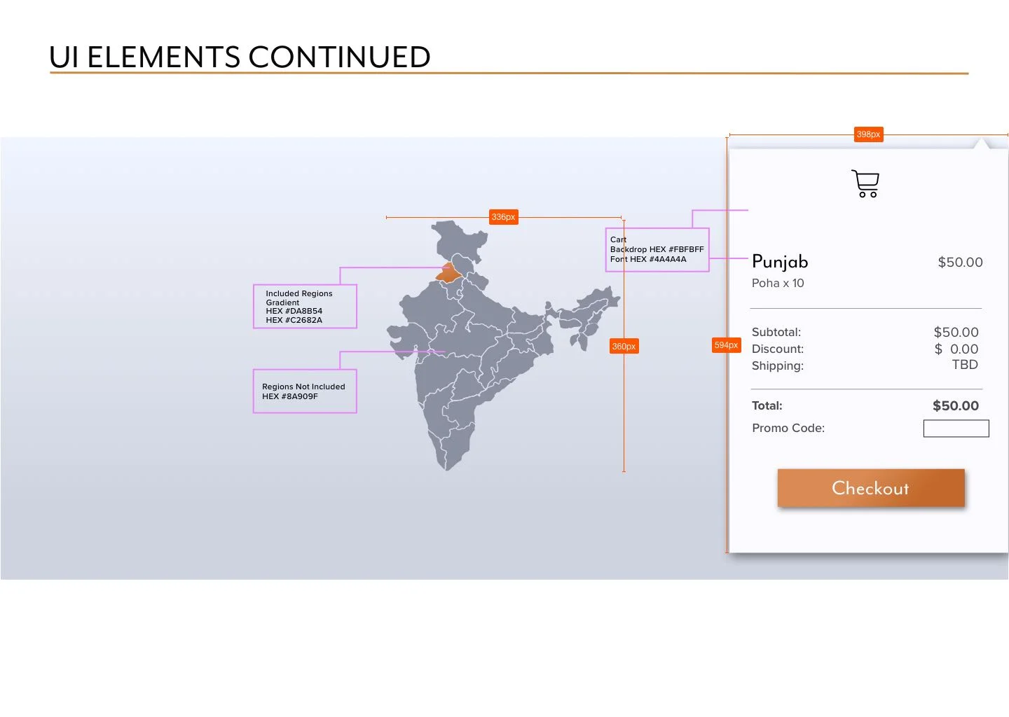
Optional drop-down and editable shopping cart
Users felt more comfortable adding things to their cart when they could see the purchase total, keep track of their spending, and make changes to the items in their cart throughout their browsing journey.
Products categorized into meal time/type (i.e. breakfast, lunch, and dinner)
Users felt it would improve the product browsing experience to divide the meals/packets into their typical Indian meal times for those who are unfamiliar with these Indian dishes.
The problem statement
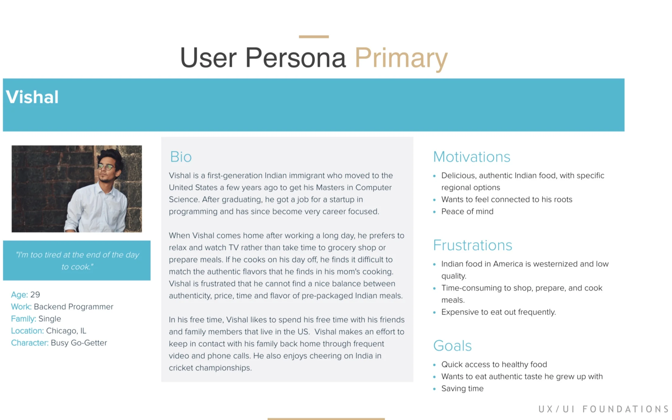
The busy student/working professional, of South Asian heritage, needs a convenient and affordable way to access regionally authentic Indian dishes because they consistently lack the time to prepare such quality dishes themselves.
Visual Competitive Analysis
The visual competitive analysis of successful meal plan services in the market revealed these trends:
Hero images
Hero images introduce giant, tasty, food, enticing the user right away
Filled icons
Filled icons feel playful and welcoming
Sans serif typography
Sans serif typography elicits that fresh and modern feeling.
Segmented block layouts, with product-focused imagery and colors
Block layouts divide the content cleanly and allow the products to shine while playing up specific colors seen in the food images. Integrating the colors from product imagery give the sites a cohesive feeling.
Clean and modern with white space and sharp-edged buttons
Clean and modern design feels sanitary and trustworthy in the preparation and delivery of food products.
Individual UI design direction
Together with our Client’s input and a more solid UX framework my collaborators and I were able to kick off our individual design explorations.
Mood boards
It was important to the client that we incorporated spice colors like deep reds and oranges. The client specified that they wanted something that felt modern but authentically connected to India.
A major development happened at this point in this design process. In the middle of creating mood boards my collaborators and I were given a test shot (below, left) from a photoshoot in progress. We were very sensitive to our clients’ desire to launch their website redesign as quickly as possible.
Given our limited time and resources it was in our client’s best interest to move forward with the aesthetic direction of their photoshoot. The test shot (below, left) is nicely laid out but the lighting and treatment created blue moody tones that greyed out the food. In the photo (below, right) I increased the brightness and contrast, changed the hue, and turned-up the saturation of the spicy orange-yellow to breathe life back into the food.
Once I enhanced the product photo I quickly pivoted, adjusting my mood boards to accommodate this new design element.
Modern & sleek (fig 1)
The dark graphite background allows for more contrast behind the lighter blue tone photo and the subtle gradient adds movement and interest.
I paired serif Orpheus Pro with sans serif Mr Eaves San OT. Orpheus Pro adds modern elegance and Mr Eaves San OT contributes a delicate sleek but not stuffy feeling.
I used thin white lines to frame and bring focus to the content
I experimented with the deep orange/red color in the content dividing lines and spice-indicating peppers
Calming & elegant (fig 2)
I chose calming light blue background colors to sit quietly behind the louder orange/red spice colors
I explored typography pairings Didot bold and Proxima Nova light that together bring out that elegant and clean feeling.
I also explored the pairing of a feminine hand hewn cursive LingWai TC medium with Proxima Nova light to add a nurturing soft feeling next to the clean and modern Proxima Nova.
Colorful & welcoming (fig 3)
I used Copperplate regular for it’s down-home and rustic feeling, paired with Shree Devanagari 714 regular for its round friendly quality
I included line drawn spices to enhance the home made, casual feeling
I explored using a warm spice background color that was taken directly from the food photography to determine in testing if the color supported or pulled focus from the image.
I also brought the framing device in to draw color and the eye up the page to the title/header
Style Tiles
After desirability testing mood boards it was clear that users were consistently drawn to my modern, sleek, and dark style tile (above, fig 1). They were particularly drawn to the contrast of the photo and colors on the dark background. Overall, users specifically connected to India and Indian food through visual references to spices.
Moving forward from desirability testing of my mood boards one of my main challenges was to integrate spicy orange and red colors into the design without distracting from the product. Based on user feedback I needed to incorporate more spices and use orange sparingly, make sure all of the elements were elevating the new product photos, and strengthening the visual connection to India.
I integrated the test shot/product photo, implemented oranges and reds into the design, tried out different framing devices to define the content, implemented main takeaways from the UI visual analysis, and continued to explore different typographical pairings.
Modern & sleek (fig 4)
I sparingly integrated pops of orange in The Cumin Club name and kept the orange spice-indicating peppers to gauge how much the orange would distract or attract users from the content.
I experimented using the modern framing device in different ways. I extended the framing device to frame out the drop down shopping cart
I created cards for cart items and realized it would be helpful for users who might be unfamiliar with these dishes to keep the product photo with the item details throughout the checkout process
I explored different typefaces and treatments of The Cumin Club name. I vertically stacked The Cumin Club name to better integrate the “The” and felt that the typeface Mr Eaves San OT felt more modern but still captured the essence of their existing logo.
Calming & elegant (fig 5)
I continued with the calming light blue background and the Didot bold & Proxima Nova typeface pairing. I got rid of the cursive in this style tile to focus my visual language on calm, elegant, and clean.
I explored a possible way to draw focus to “Cumin Club” by dividing “The” from “Cumin Club” both through two kinds of typography and different backdrop colors.
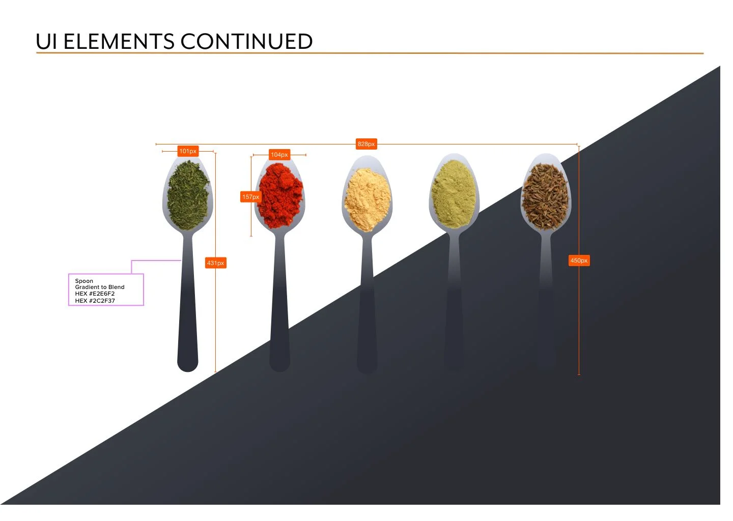
I added imagery of dried spices to draw out the connection to india and to the dehydrated ingredients of the product.
I explored displaying the product photo and information in a card with product name and info in a deep orange bar above the product photo to draw focus to the product and have the info at a glance.
In the deep orange bar I continued the typography pairing of Didot bold & Proxima Nova and experimented again with a focus on the specific words and the division of information.
I also added a “Get Started” button to find an accessible contrast ratio of text over the deep orange color.
Colorful & welcoming (fig 6)
Based on negative user feedback I ditched the harsh and rustic Copperplate for a cleaner and lighter Proxima Nova light and I added the hand-hewn cursive LingWai TC medium to bring out a softer, more welcoming feeling.
Instead of the delicate framing I had running up to the top of the page, I balanced the page with the warm spice background color as the header and built out a rounded card for the product photo and information to add a more playful feeling.
I enlarged the hand-drawn spices and set them around the content to continue drawing out that casual & playful feeling.
I used the LingWai TC cursive for the product title/name and Proxima Nova for price and button text
I explored a bright yellow color for important buttons and calls to action to brighten up the page and bring a joyful, colorful energy to the interface.
Hi Fidelity Mock-ups
After desirability testing style tiles I noticed a troublesome pattern of users associating light & bright interfaces with freshly prepared food; which is a problem because The Cumin Club’s product is a packet of dried ingredients. This association is understandable since the majority of meal plan services are fresh or frozen and they use a lot of white space and bright colors on their sites. I realized I needed to differentiate The Cumin Club’s dehydrated/dry product from the fresh/frozen meal market. On top of the positive feedback for my dark mood board and style tile, this insight solidified my decision to move forward with a dark interface.
Home Page (fig 7)
I ditched the thin line framing devices I explored in my mood board and style tile because they were creating visual noise and stopping the eye from moving down the page. Instead I used blocks of color behind each section and then broke that block/frame with image cutouts and negative space to create better visual flow to encourage users to scroll down.
I continued with the subtle linear gradients in both the slate grey and ice blue blocks of color to create cohesion with the product imagery as well as add subtle movement and interest. I used the eye-catching dark-orange gradient on my most important buttons, header tab indicators, two section titles, and user email input field.
Introductory Changed the order of the product process
In this top hero image:
I photoshopped the edges so the dishes hang off to create better visual flow. Increased the brightness and contrast, changed the hue, and turned-up the saturation of the spicy orange-yellow to breathe life back into the food and spices.
I added a compelling image of a prepared product with spices to connect to authentic Indian ingredients, get users drooling, and encourage users to browse.
I prominently displayed “5 Minute Indian Meals” to clarify the instant nature of the product.
I incorporated the deep-orange peppers from The Cumin Club’s original logo into my vertically stacked, Mr Eaves San OT, logo design.
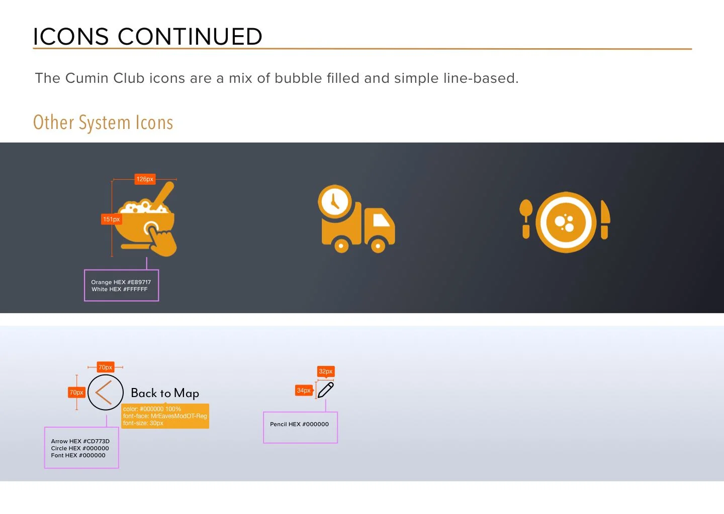
In this second “Welcome to the Cumin Club” section I used the icons purchased by The Cumin Club. Under these icons I adjusted the original content in this product summary to better reflect the dried ingredients and instant “just add water” nature of the product.
Browse Page (fig 8)
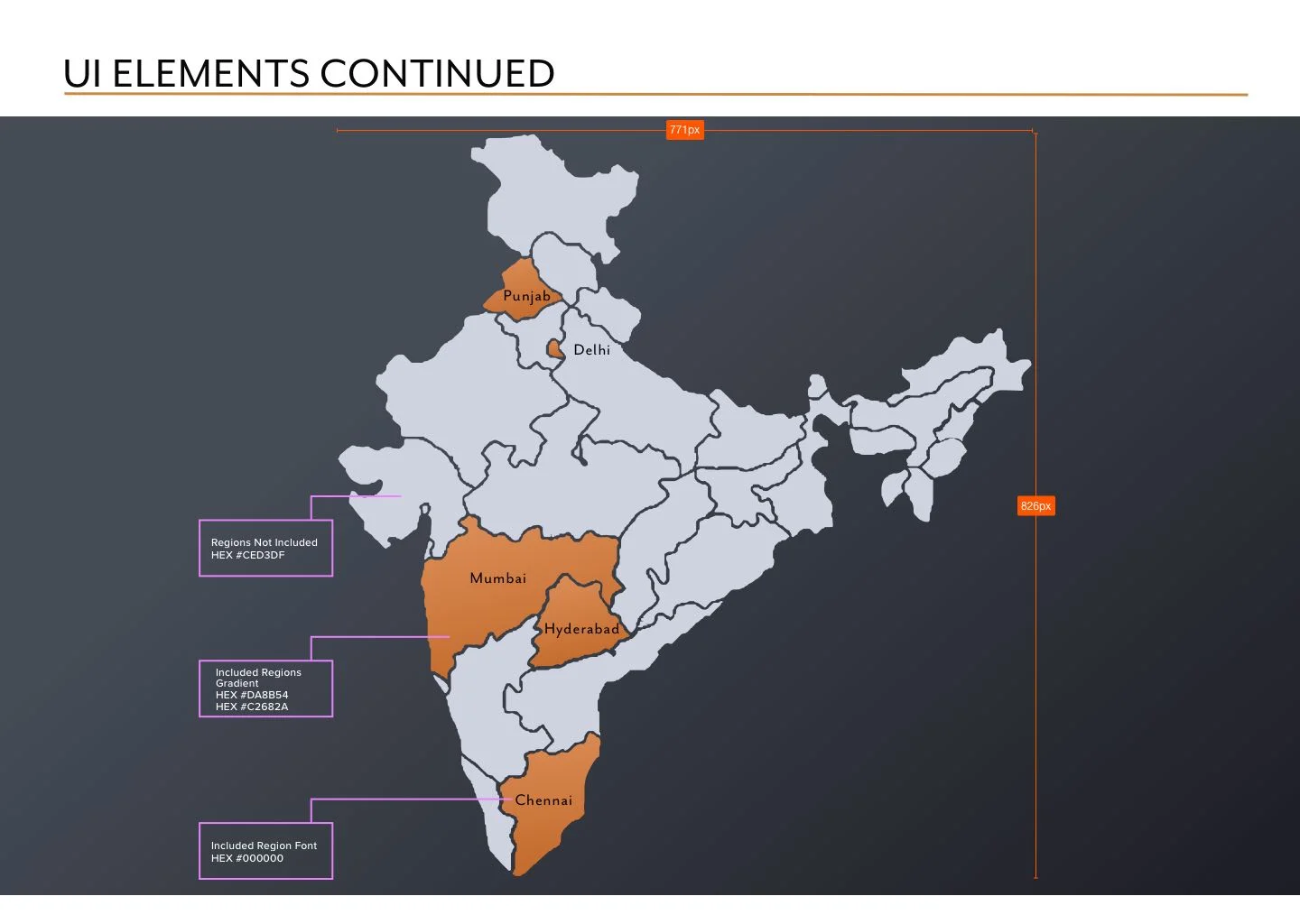
This browse by region page became the bridge between the home page and the product page. This layout helped users better understand that they could not shop cross-regionally. This helps funnel users into a specific region with a little explanation about cross-regional shopping "coming soon."
A Future consideration, to further educate and engage users in the Indian culture, could be to include regional information in hover states on browse by region screen.
Product Page (fig 9)
In this product page I carried the light ice-blue backdrop through for better readability/accessibility. Ultimately dark text is easier to read on a lighter background. This light backdrop changes things up but maintains continuity. It adds a little light but still feels a part of the same site and design.
At the top of each region’s product page is specific info about the regional cuisine, instructions to pick a minimum of 10, what’s included with the purchase, and how much each packet yields.
Each product could be eaten anytime, but for users not familiar with Indian cuisine, the products are divided into general meal times of day (ie breakfast, lunch, & dinner.
The “Back to Map” button/arrow makes navigating to a different region easy but helps clarify that the user must purchase a minimum of 10 products from any one region in order to check out.
Prototype
Narrated Walk Through
Style Guide
Future Considerations & Final Thoughts
Considering the time constraints of the design work for The Cumin Club my collaborators and I created this list of future considerations and recommendations that can be examined and potentially implemented to enhance the customer’s experience with the website.
Include lifestyle imagery
Users expressed a desire for some lifestyle photography and photographs of people to establish a more personalized connection. This was especially expressed in the “Our Story” section on the homepage, where a photograph of the founder would feel relatable and personable.
Provide packet imagery to clarify product
In multiple usability tests it was apparent that most users didn’t know that they would be receiving an instant packaged product, and instead thought that they would be receiving a fresh, hot meal. Through packaged product photography and clear language this could help prevent confusion, and it would be especially transparent and comprehensible if the information or photography is presented “above the fold” (in the first section of the homepage).
Clearly explain the subscription service
Currently The Cumin Club is focused on a subscription service model, but the membership aspect and subscription service aren’t clearly explained on the website. Users didn’t understand what the membership entailed and weren’t sure if they wanted to become a subscriber. By providing more details in clear language this information could be more comprehensible and desirable.
Emphasize regional distinction using map
Our testing indicated that Indian-Americans and Indians alike didn’t always know the different regional foods in India. For some the distinction between North and South Indian food was more important than knowing which region the food was from. The map I implemented would be a great tool to provide future hover states about the regions for more clarity.
Design for mobile
A large number of customers will look at The Cumin Club website on their phone. Future designers and programmers will need to consider this when designing and coding the final website.
Throughout this project my collaborators and I learned to move with our client. As a brand new business The Cumin Club was understably eager to implement our recommendations and relaunch an improved website. They began implementing those recommendations during this process so we learned to keep abreast of the changes they made along the way. We were flexible to the needs of the project. We made sure to engage our client in our process and got the assets and feedback we needed to move our project/designs forward.
I am continually developing my instincts as a UI designer and learning when to let go of things that don’t serve the project and users. The UI design process is unlike my past experiences with costume design process. The UI design process is uniquely democratic because it is user testing that ultimately determines next steps. I love it.

